Carrd Review: Free, Fast Web Builder Right for You?
Website development without coding is not a new thing anymore. WordPress has been helping citizen developers create websites and landing pages for 15+ years now. Although you...
Building a website was a tough task back in 2010. But after the introduction of No Code website builder platforms like Zyro and Elementor, it has become smooth and effortless. Anyone with a computer, internet, and enough willingness can build an amazing website without writing a single line of code within a few days. [1]
The complexity of these websites varies depending on your requirements. But if your goal is to create a one-page website with all your business information, Carrd is the perfect platform for you. In this blog, we will give you an overview of the platform and a tutorial on how to use carrd to create a one-page website.
A quick note – If you are planning to buy a paid plan of Carrd, use our affiliate link. That will help us in the pursuit of providing valuable content for free to you.
Carrd is a No Code platform where you can build a responsive website and connect it with email marketing platforms like Converkit, Mailchimp, and MailerLite. You can also integrate payment gateways like Stripe and analytics platforms like Google Analytics to your website with simple drag and drop.
Here are a few popular types of sites that you can build with Carrd. Templates for each of these categories are available in their library.
Create your individual profile where you have all your professional information. It could be used for networking or for an employer.
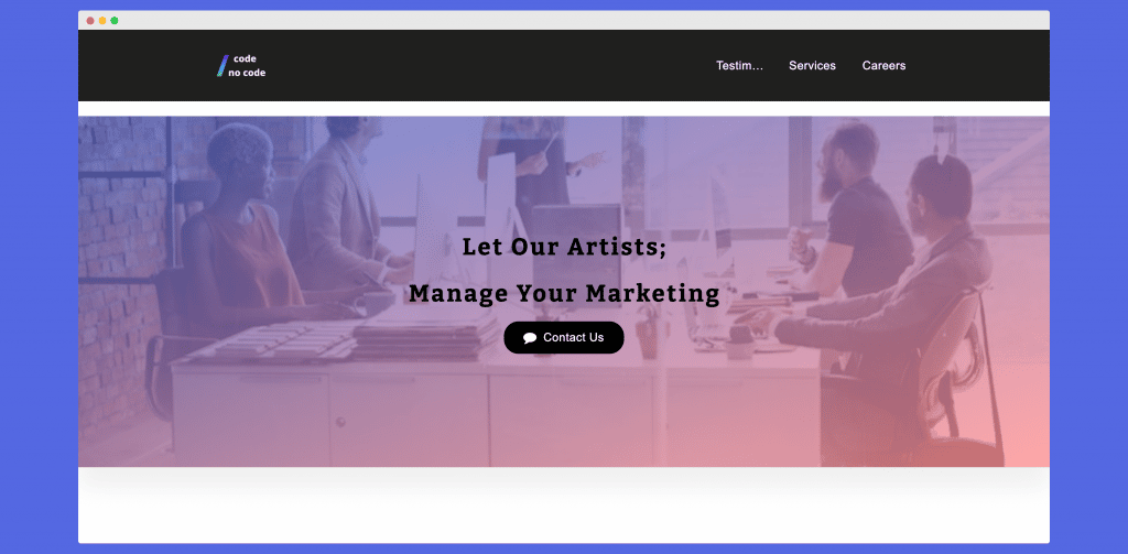
Build a page that provides information about your products or services. It would have basic info about your business. For example, how to contact you or details of the services you provide. Landing pages are best for small local businesses trying to grow their audience.
Create attractive newsletter forms to collect information from your audience. Collect contact forms, sign-up forms, or custom forms with Carrd. It seamlessly integrates with 12 email marketing platforms including ActiveCampaign, Revue, SendFox, and Sendy.
Showcase your work with Carrd. This kind of website is perfect for freelancers trying to make their way into the professional world. Sometimes it is style over substance. So even if you have a small amount of work in the industry, you can present it in an impressive way through Carrd.
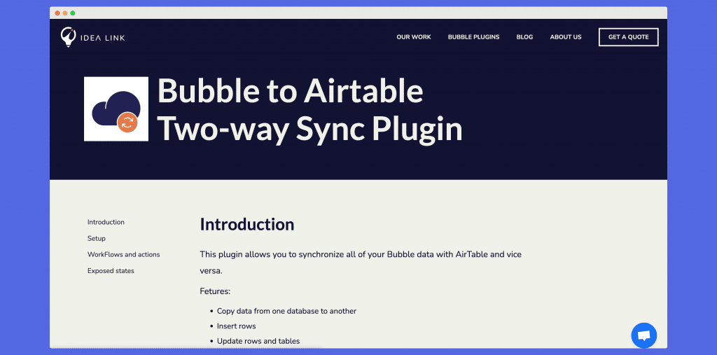
This is a hybrid between a one-page and multi-page website. Sectioned websites are one-page websites divided into different sections that load when you click on that section. If you have a lot of information to cover, you should create a sectioned website and segregate your viewer’s attention.
In this tutorial, we will build a Carrd website for an agency. So keep in mind that all the references and settings will be adjusted according to an agency’s needs. But if you have something else in mind, you can obviously tweak the elements and get your own layout.
The final result of this tutorial looks something like this: Carrd Tutorial Website. It is a simple one-page website that has 1 header, 1 footer, a hero section, and a contact form. Let’s learn how to create each of these sections.
Here’s the step-by-step process of building a website with Carrd:
You need to buy a domain to host your website. It usually costs around $20- $40 for a unique domain. But if you choose a very popular name, the chances are it would have already been taken and have a high price to it.
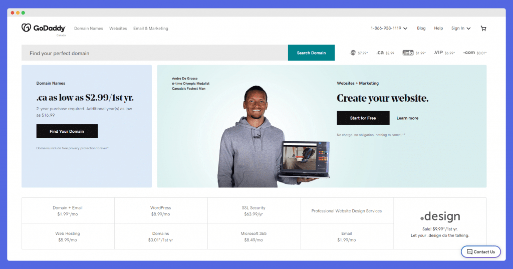
Try and search your domain names at GoDaddy or any other custom domains provider.
We suggest you buy the paid plan eventually since the free plan doesn’t allow you to add a custom domain to the website.
If you are a new user, start with the 7-day free trial where you can test out all the Carrd’s core features and additional ones for free. It gives you enough time to experiment with the tool.
There are two ways you can create your Carrd website. You can either choose a template from their template library or start from scratch.
If you want to take the template route, it is just editing the content and format changes. But it is not always easy to find a template that exactly matches your requirements.
That’s when you start with a blank canvas. This will give you complete design freedom.
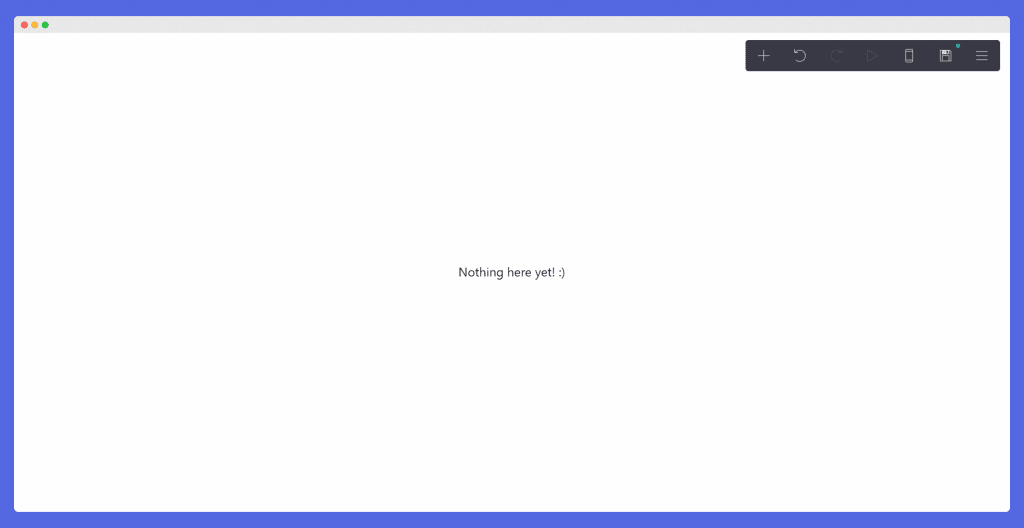
When you click on it, you will be greeted with a “Nothing here, yet! :)” message.
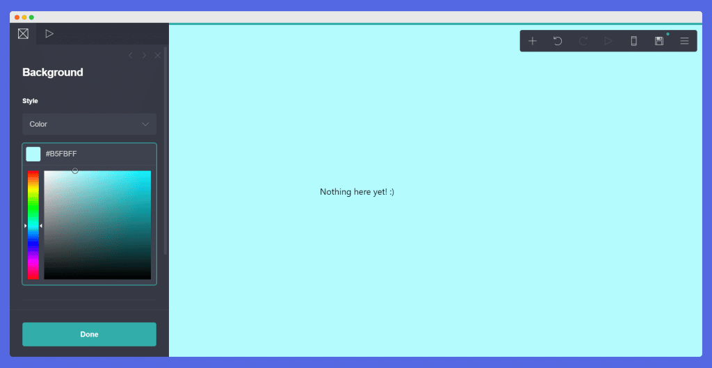
The background represents the color or image that will be used throughout your website. You can always customize the section background colors.
Unless you have really strong feelings about a color attached to your design, we suggest you go for white or any other lighter tone of color.
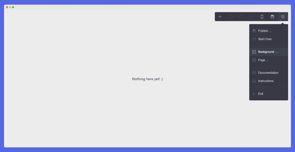
Go to Options >> >> Choose the color code – White (#FFFFFF) or a light blue color (if your design guide allows).
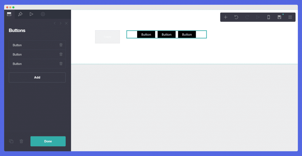
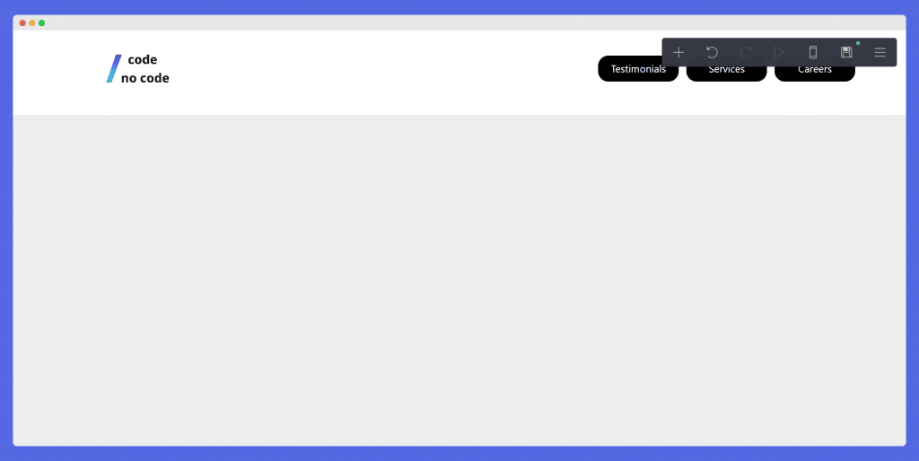
Navigation Bar is the UI component at the top of your page that contains links to other sections of the website. Our Nav bar will have a logo and 3 links i.e. Testimonials, Services and Careers.
Your page should now look something like this.
Your page should now look something like this.
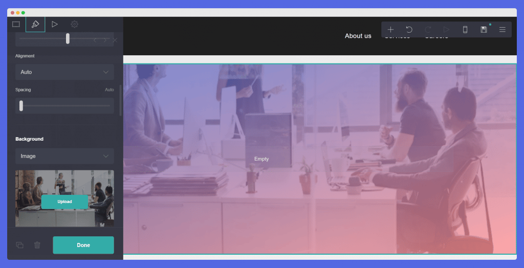
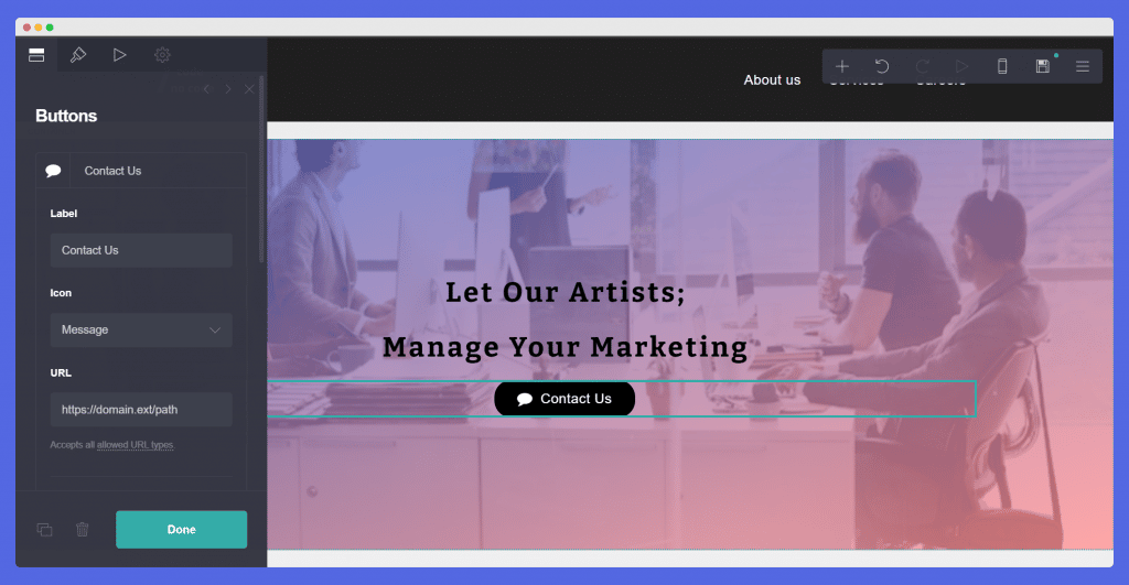
Hero Section is the body of your page. It is the first section that can be seen immediately under your logo. The hero section is the main highlight of your website.
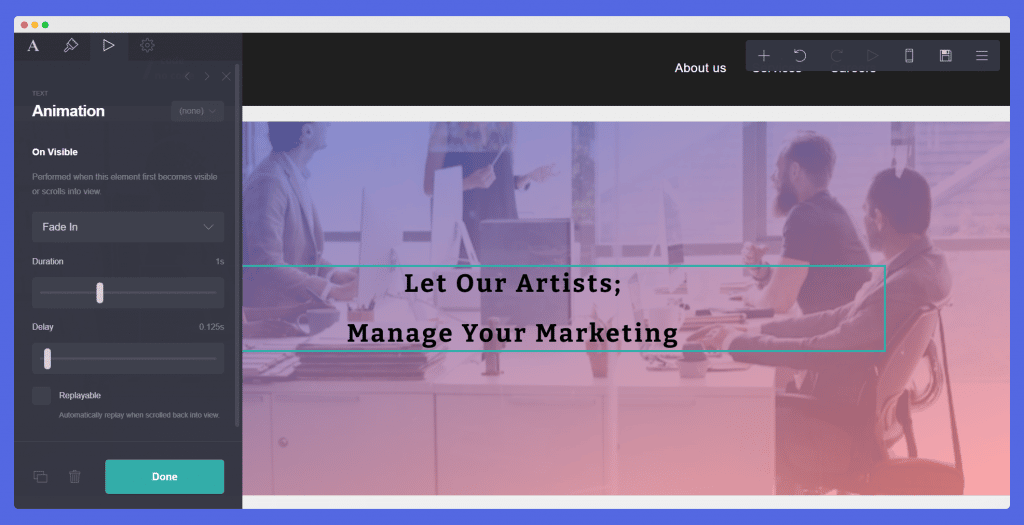
Add a button right below your headline to boost conversions directly from the landing page. In our case, we will be adding a contact us button.
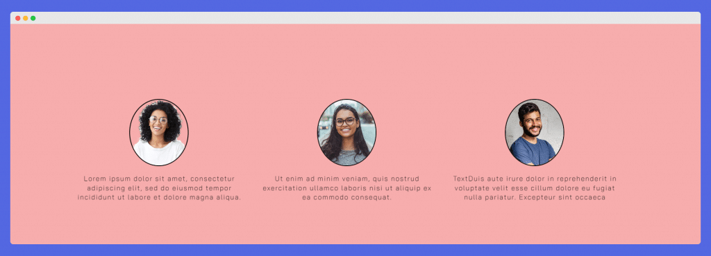
I have also added the circle border to give it a little funky look. You can adjust that according to your preference.
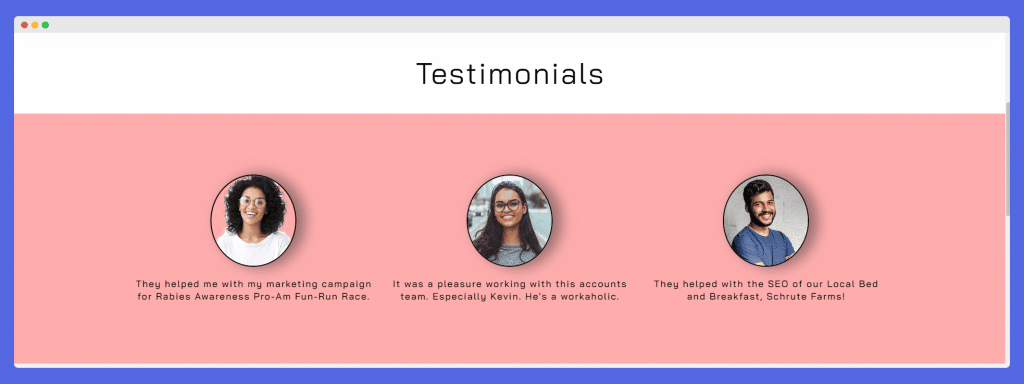
I have also added a small shadow in testimonials just to give it a slightly premium look. You can align it according to your requirements. This is what the final result of testimonials will look like:
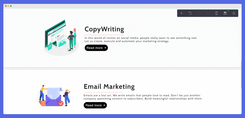
Similar to the last step, we start by adding a container with two columns. The left one is for the image and the right one is for text. The service section will have information about our agency’s services. Currently, we will be adding copywriting and email marketing.
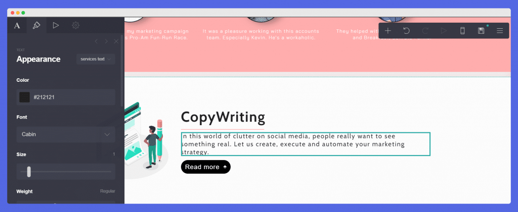
Your final service section would look something like this.
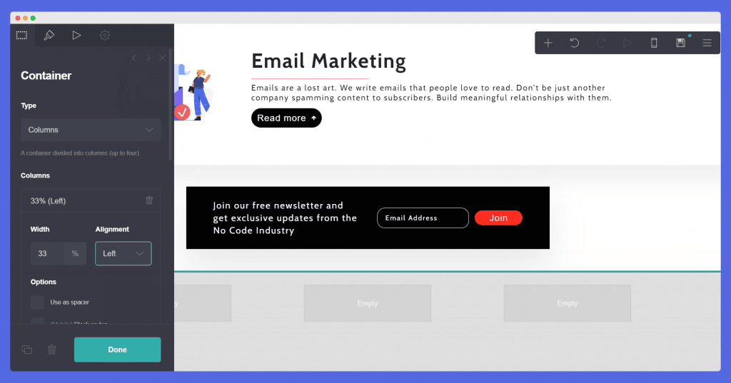
You can add a sign-up form, contact form, and customize your form. We will be creating a contact form to collect newsletter subscribers.
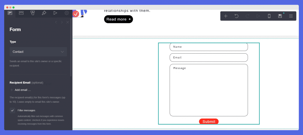
Once you adjust little tweaks, here’s what the form would look like:

Create a footer where users can easily access all your information. This will become crucial once you create multiple pages for your websites. For example, if you have a blog, you can add links to your featured blogs in the footer to increase traffic.
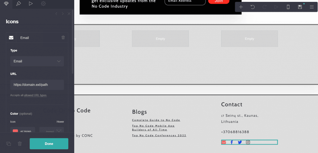
You can change the color of your social media icons however you want. I have tried to keep the original colors here.
Your users should be able to navigate through your website smoothly. Hence, Carrd has a feature called scroll point. For example, if someone clicks the contact us button on the hero section, they should jump to the contact form. Scroll Control is how we can link these sections to a button.
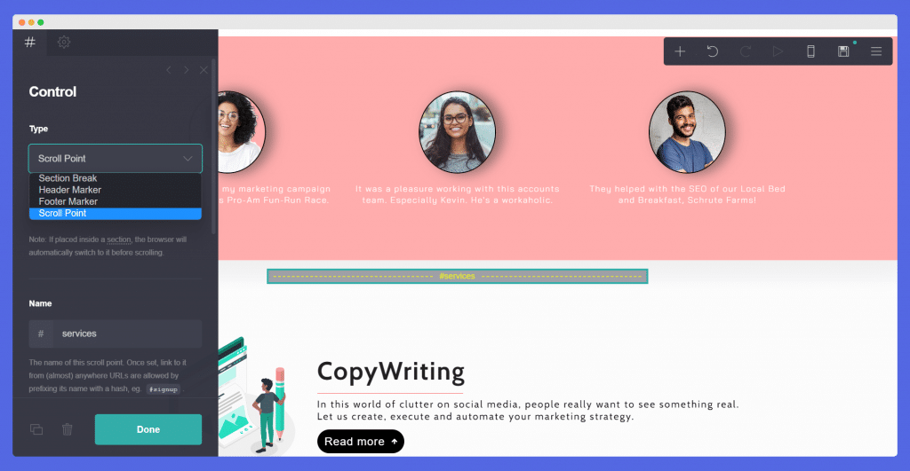
Now click on service on the nav bar and write ‘#services’ in the link section.
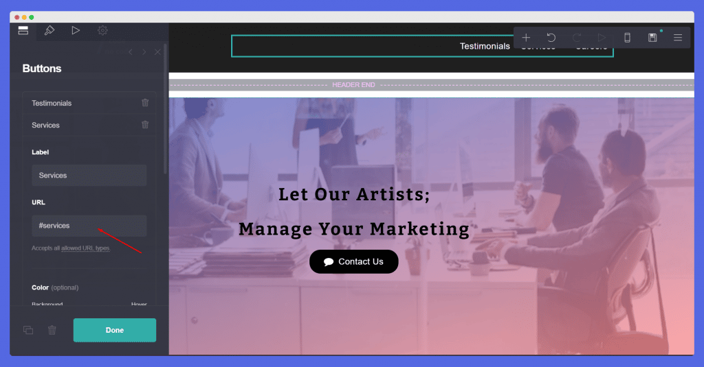
This makes a huge difference in making your website smooth.
Baam! Congratulations. You have successfully created your first Carrd website. Review your website for any small errors like typos or potential broken links.
Publish your website by clicking on the floppy disk (Save) icon on the top right. Go to the published website and stare at your majestic creation for a while.
Now that you have created and published the website, it is time to update it. Power up your website by adding Google Analytics to Carrd. They are experimenting with beta features a lot. You can keep an eye on their change logs for new templates and feature updates.

If you are ever stuck somewhere you can search your query on their docs. It is efficient and easy to navigate. Apart from that, you can also check out the mobile responsiveness of your website, if you have a lot of traffic coming from mobile users.
Building a website on Carrd is easy. Perfecting a website on Carrd might take some time. Small things like letter spacing, margins, and alignments always have room for improvement.
Have a clear goal in mind before starting this Carrd tutorial. Once you know your goal behind creating a website, you can reverse calculate everything.
If you have any queries, you can tweet us at @codeornocode. Follow us to read such informative content on No Code Tools, News, Tutorials, and Reviews.